Latest Features in Power BI
- Power Platform
- November 05, 2024
-
“Latest Features in Power BI”
- Modeling
1] Write DAX queries in DAX query view with Copilot
The DAX query view with Copilot is now available in public preview! Enable the feature in the Preview section of File > Options and settings > Options, click on DAX query view, and launch the in-line Copilot by clicking the Copilot button in the ribbon or using the shortcut CTRL+I.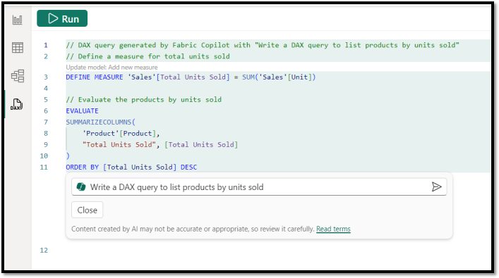
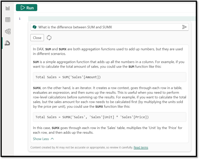
With Fabric Copilot, you can generate DAX queries from natural language, get explanations of DAX queries and functions and even get help on specific DAX topics. Try it out and see how it can boost your productivity with DAX query view!
2] Enhanced row-level security editor is Enabled by Default
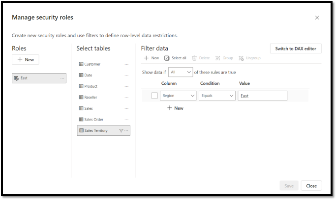
We are excited to announce the enhanced row-level security editor as the default experience in Desktop! With this editor, you can quickly and easily define row-level security roles and filters without having to write any DAX! Simply choose ‘Manage roles’ from the ribbon to access the default drop-down interface for creating and editing security roles. If you prefer using DAX or need it for your filter definitions, you can switch between the default drop-down editor and a DAX editor.
- Service
3] Edit your data model in the Power BI Service
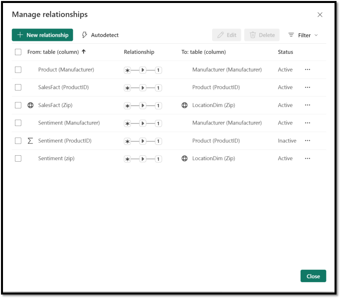
· Autodetect relationships
Creating relationships for your semantic model on the web is now easier using autodetect relationships. Simply go to the Home ribbon and select the Manage relationships dialog. Then, choose ‘Autodetect’ and let Power BI find and create relationships for you.
- Developers
4] New title flyout for Power BI Desktop developer mode
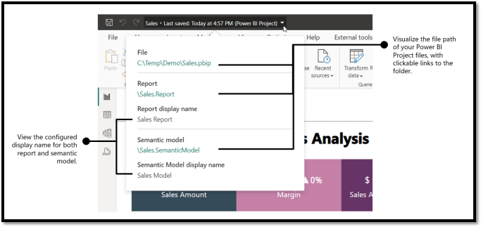
You can quickly recognize when you are working on a Power BI Project (PBIP) by looking at the title bar:

If you click on the title bar, you will see a new flyout that is specific for Power BI Project. This lets you easily locate the Power BI Project files as well as the display name settings for the report and the semantic model. You can also open the folder in file explorer by clicking on the paths.
- Visualizations
5] New visuals in AppSource
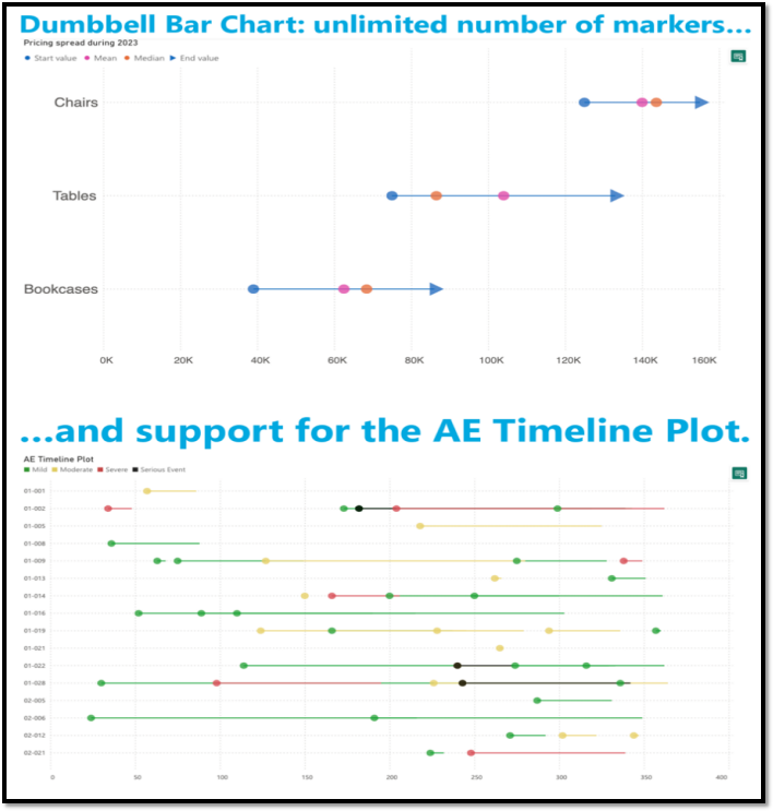
Dumbbell Bar Chart by Nova Silva
In the latest release, we’ve introduced the capability to display multiple dumbbell bars in a single row, allowing for the presentation of more than two values in a streamlined manner. This update opens new possibilities, including the creation of the Adverse Event Timeline plot, or AE Timeline.
Conclusion, All features are readily accessible within Power BI Desktop, empowering you to evaluate this visual on your own data. Dive into enhanced functionality and discover new insights effortlessly.
Start Your Data Journey Today With MSAInfotech
Take the first step towards data-led growth by partnering with MSA Infotech. Whether you seek tailored solutions or expert consultation, we are here to help you harness the power of data for your business. Contact us today and let’s embark on this transformative data adventure together. Get a free consultation today!

We utilize data to transform ourselves, our clients, and the world.

Partnership with leading data platforms and certified talents


